Slide Design

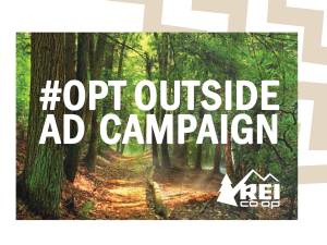
For this final project I chose to do a slide show as if I worked for REI. REI is all about the outdoors and for Black Friday 2017 they had an “Opt Outside” Campaign to help people enjoy the outdoors this holiday season. I loved this idea and thought their ads did so well to represent the joy that comes from nature.

Since this presentation would be given to members of the REI Company, I wanted it so have a simple, outdoorsy feeling. To do this, I added zigzag to the upper right hand corner of the slides. I chose a zigzag pattern because I wanted them to match the line of the REI logo and also to add a rougher, mountainous look. I placed the zigzags in the top right corner so they would not interfere with the text as it was being read. That is also why they are so light in color, almost like a watermark. On the transition slides I used a very light blue-green color to match both the original ad and also my new ad.
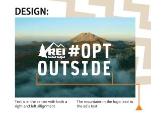
 ORIGINAL AD


Design

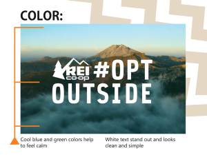
In this ad REI placed the text in the center, both vertically and horizontally. Usually center alignment is hard to read but because they made it so it was also both right and left aligned, it creates a balance for our eyes. We don’t have to search for the beginning or end because it is in a visual square and we know what is supposed to come next.

The logo was placed in the left corner as if to say that is what is most important and we should read first. The tree catches our eye and the mountains lead our eyes to the line of text. This helps us to make a subconscious connection between the logo and the text.
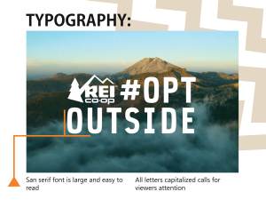
Typography

I love the font REI used for this ad! It is a simple san serif font. The letters in the ad are all capitalized as if they are shouting at us to read them. Since there are no serifs (the little wings that sometimes come off letters) the text is still very easy to read even though it is all capitalized. It is almost as if they right aligned their text so the logo could fit in the space to the left. This creates a visual box that makes it look both left and right aligned. This is very visually pleasing to the eye as it feels contained yet very open.
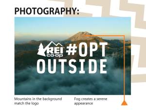
Photography

Also in the backgrounds REI used a photograph of the mountains. This is one of the most commonplaces a person goes while enjoying nature. It also matches the mountains in the logo. Even though they are quite different, subconsciously we connect the two and it is counted as repetition in our minds. This repetition makes it easier for us to associate the image and the company as one.

Color

Blues and greens are generally soothing colors. They are generally associated with nature and emote a feeling of safety, relaxation, and freshness. These are great for REI because without doing much they promote these feelings through their advertisement. When people see these colors they feel a sense of awe and want to become a part of what is going on. It is like an unseen call to action, an invisible invitation to join in on the cause. By using these refreshing colors, more people feel inclined to be a part of the campaign.

The white text on the ad stands out from the background. It presents the ad with a clean appearance. The white text is a simple color that directs or attention but isn’t distracting.

NEW AD

Design

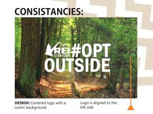
For my slide I also placed my text in the center of the ad. Like REI’s original ad, I left aligned the logo with the text. For my scenic background I chose to use a forest. I wanted it to be a little more simple than the original to imply that going out in nature doesn’t necessarily mean you have to hike a mountain. Walks in the woods or simply enjoying the trees could also count into the Opt Outside Campaign.

Typography

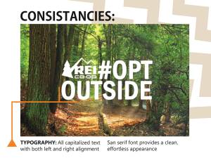
In my ad, I couldn’t quite find the original text. Instead, I chose a similar san serif font. I chose one that had softer edges to more closely match the original. I used all caps to make my ad also “call out” for attention. I made sure that my text aligned on the right and that the logo lined up with the edge of my text on the left. I placed this block of text in the center, just as the original ad did.

Photography

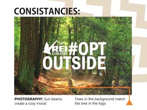
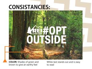
I liked how in the original ad, they used the mountains from the logo as the main photo for the background. So I decided to also play on that idea. Since there is a tree in their logo, I chose a picture of trees. I also wanted to have a cozy mood, since the original was more of a refreshing feel. I chose this picture because I liked how it seemed like the sun beams were coming through the trees without being an obvious beam of light. I darkened a part of it so my text would stand out a little better also.

Color

I wanted an earthy feeling in my new ad so I looked for pictures with some darker greens, browns and yellows. These colors are warmer and help to give a comforting mood to the photograph. Since the original was such a cool ad and mine was so much warmer toned, I was worried that the white text would be too much of a contrast. I played with a few different off white colors to help warm up the text also. After many attempts though, I decided to just go with a pure white for the text. I ended up choosing the pure white because it gave my ad the clear, crisp look that I wanted. I think by choosing the pure white it also creates another similarity between the original and the new ads.

General Slide Show Overview

When I think of colors for outside, I always think of greens, browns, blues, and yellows. Since this campaign is all about going outside and enjoying nature I wanted to use colors that would commonly be associated with the outdoors. For my transition slides I used a light blue-green color to tie in the cool feelings of the original ad and the cozy feeling of the new ad. Along the top right corner of my slides I did three zigzag lines to match the uneven edge of mountains. I created the zigzags using Adobe Illustrator. I chose a light tan color for those zigzags so they would not be distracting to the ad or the copy on the slides. I chose a triangle as the base of my pointer lines because I wanted it to have the angles of a mountain and arrow. I chose to use orange as the color because it is a bright color that stood out above both ads. It is also a color that can be found in nature so it looks like it belongs more than a red or other bright color.

I really loved doing this project! I liked seeing how there are so many options and changes you can easily make while using the Adobe InDesign program. It was cool to see how the three programs (Illustrator, Photoshop, and InDesign) work together so seamlessly. It was cool to learn how to mesh two different color schemes and ads into one slide show. Finding ways to stay consistent while being unique was a challenge but it was fun!

Links:

Forest: https://pixnio.com/nature-landscapes/forest/forest-path-wood-tree-landscape-nature-leaf-environment-ecology

REI Original Ad: http://gaia.adage.com/images/bin/image/jumbo/REI-_OptOutside_Anthem_Film_15.jpg

REI Logo PNG: https://en.wikipedia.org/wiki/File:Rei_coop_logo.png

Dust Pan Creative Ad

Introduction Have you ever had to do a project and just didn’t know where to start? Well, I know that feeling pretty well after this week. For our project this week we were given a random object and situation to make a creative ad for. My object was a dust pan. I was assigned to be selling this dust pan to a woman who was married in her late 50’s early 60’s. Also given was what type of media ad she would respond to. For my woman, she liked magazines and social media. So I made two ads, one is for a full page in a magazine and the other is for a Facebook ad. Magazine Ad Facebook Ad Coming up with a creative idea was probably one of the hardest parts about this project! I did all sorts of word webs, random drawings, games with my friends and family and I still couldn’t find something that seemed to fit. So after a while I decided to try putting myself in a 58 year old woman mind set. What they would relate to best. At that age they surely have been through some rough times. Since she was married she probably has had kids that bring in lots of dirt and mud, especially after a storm. So I decided I wanted to play on the phrase “storms of life.” And since I was doing a dust pan I wanted the dust pan to be sweeping up the storm.

Magazine Ad

For this one, I was able to spread the storm and dust pan out a little more. I used a right alignment for the logo and body text. I made it so they lined up with the line of the G from “TOO BIG”.  I was going to also align the words “No mess is” on the right but when I tried it out it made the right side of the page look heavy and the left was empty. So I aligned the “no mess is” along the right side lining up with the edge of the T.

Facebook Ad

For my social media ad, the shape i had to fit my ad into was completely different. It took me a couple of tries to find a layout the actually looked alright. For this ad I used a right alignment for all the text. The logo is still in the bottom left corner. I made sure the spacing on the text and on the logo were the same distance from the edge of the ad.

Photography


I decided to mix a couple of pictures to create a stormy feeling at the top of the page. I chose a tornado because that is one of the most commonly thought of storms, and it is easy to recognize. Lightning is also commonly thought of during storms of different sizes. Rain also seems to accompany a variety of different strengths and magnitudes of storms. The picture with the army trucks and big puff of smoke was used for the bottom of the tornado. I feel like when someone imagines a tornado they imagine the cloud of debris at the bottom. The tornado’s original “cloud” was not very big and looked a little silly so I added a new “cloud” onto the bottom. For the dust pan, I was not able to find any fitting pictures online. So I took a trip to my local grocery store and borrowed a nice new dustpan to take pictures of. It actually turned out better than I had expected!

Color

Since storms are kind of dreary, I wanted the page to be a little darker with a bluish haze over the whole storm. Where the storm meets the dustpan I wanted it to be clear to give the effect that it was being swept up into the dust pan. The dustpan is on the white surface because white infers cleanliness. Since this is an ad for a dust pan, clean is what I want to convey! I chose a red dust pan so it would stand out. Also the logo of O Cedar is red so I thought it would help the customers connect the two better.

Typography

For the text, I used two different fonts. In yellow I used Berlin Sans FB. I liked it because it was close to the font that the O Cedar logo uses. Also, it is easy to read whether it is big or small. I decided to make it yellow because it is a good contrasting color to both the blue and reds around it. Since it is lighter, it also stands out more, making it easier to read. I used the font “Elephant” for the words too big because I wanted it to really stand out. I like how the serifs are mixed with the modern style of text. I feel like it was good to use because for an older woman, the serif fonts are familiar since that was the main style used when they would have been growing up. The modern aspect of the Elephant font helps to give the feeling of a new, better, more modern product. I used white to stand out from the dark background. It also incorporates the white lettering from the O Cedar logo. Also it helps to reinforce the clean, crisp feeling to go along with the cleaning of the dust pan.

Even though it was hard to come up with an idea at first, I think these ads turned out pretty great! The colors help to set the mood and the pop of red helps to define the important parts of the ad. There is a call to action and a website for them to go to. I believe if a woman in her late 50’s saw this ad, she would stop and read about it. It was fun to learn how to mesh pictures together and make them look good. It was a challenge to get the picture in my mind into real life but after some hard work I was able to accomplish an ad I feel good about.

Photo Credits:

Tornado: Justin Hobson

Lightning: Pixabay

Rain: Pixabay

Army Vehicles Dust: U.S. Army photo/Capt. Jeff Dillard

Dust Pan: Stacie Powell

Adobe Illustrator

This week for class we got to learn how to use Adobe Illustrator. This program is awesome for designing things on the computer. We are able to make icon sets. For my icon set, I decided to focus on children under the age of 10.  When I was a kid, I always thought it was so fun when animals had personalities. Since I loved it so much when I was little, I decided that is what I wanted to do for my icon set.

For this icon set, I made four fish. I used a light blue, dark blue and green as my color scheme. I wanted to use bright colors because children always seem to like brighter colors better. Also, I tried to keep is simple in design so that is if more kid friendly feeling. I also used different shapes for the fish’s fins and body. By using the same three colors, I created a consistency between the four fish icons. I also used the same stroke weight to give the same depth/heaviness to the icons.


Nerdy Fish

For this fish icon, I wanted to the “nerdy” personality. I did this by adding big rimmed glasses. I also used a square shape so that it looks like it has a nose to hold its glasses. I also gave it buck teeth to complete the classic nerdy look. I made it a light blue so that it was easier to see the glasses.

Girl Rocker Fish

For this fish, I wanted it to be a little more fun. I did spiky hair as the top fin. I also made the side fin a three point so that it would tie in the spikes of the hair. I also made it a girl by adding eyelashes and lipstick. I used the two types of blue because girls always seem to color coordinate. I used the bright blue for the body because it is bright and seems more girly than the other two colors.

Green Fish

For this fish, I wanted a simple clean look. I did a blue eye to incorporate the colors of the other fish. I also did a square fin as a different angle to add a little interest to this otherwise plain fish.  Since it was so simple I wanted to set it apart a little more than the blue others. I did this by making it a bright green fish.

Sport Fish

For this fish icon, I did a rectangle stripe under the eye to give it more of a sporty look. I also put a stripe around the middle to make the fish look like it is wearing a jersey. I did the jersey in green to tie the green fish into the set. I chose the darker blue for the body so that it would have more of a contrast in color.


As I did this icon set, I realized all the little details that you need to think about when creating an icon. Since icons change sizes you need to have enough detail to make it interesting but it also need to be simple enough that it can be recognized at a small size. Details like stroke weight and icon colors can have a big influence on the final design.

Magazine Spread

Magazine Spread

What is the best way to learn a lesson? I think one very effective way is through examples. For this project we were able to watch videos and learn how to use Adobe InDesign.  Through videos, we were taught how to do a text wrap, make master pages, insert shapes, and text boxes. I consider these things to be some of the most basic and important parts in creating a magazine spread.

Text and Shapes

Text wraps are when your text follows the shape of a picture, object, or another set of text. This helps to create variety in the style of your text and spreads. Master pages are a brilliant and convenient way to create unity throughout your spread. You can customize the master copy and apply it to all, or select pages. Whatever is placed on the master copy cannot be dragged or moved around which is great if you are putting text or shapes on top.  Shapes are often used in the master copy to create different backgrounds.  Shapes are able to add interest and color to a page. They can also be used in a variety of other ways, such as placed behind text to create a text box. Text is also a fantastic way to “mix up” a spread. It is easy to change the font, sizes, and placement. We learned how to do columns and have the text continue from column to column. We also learned how to put text on top of shapes, or wrap around a shape. Depending on the style of text you choose can have a big effect on the overall feeling of a spread.

Planning Ahead

Before you start designing a spread though, you first have to make a plan. You need to decide who your audience is. I chose to focus on the youth. I want kids who still live at home to read this article and learn from it. Once your audience is chosen, you can make drafts of the spread. I wanted to have a picture on the first page to help the youth be more drawn to the article. Money is important to everyone, especially for kids who rarely have much. Having Sacrifice big on top of the money is something I feel like most youth can relate to. They have to earn the money they receive, even if just a few dollars.  The other picture is of a bike. I incorporated the rule of thirds to make the picture more appealing yet still recognizable.

Photo by Stacie Powell

Photo by Stacie Powell

Design Principles

I tried using a brighter color of green to create unity throughout the spread. I did this by making my text box green and putting lines at the top/bottom of my square pictures. I used a circle text box on the middle page to tie the circle of the coins to the circle of a bike tire. I think this also helped to unify the spread in a little way. I wanted the spread to be simple, like the story so I left the background a clean white color. I used a decorative font for the first part of the title to imply the feeling of love and kindness but also used a modern, harsher font for the sacrifice to give a rougher feeling. I also incorporated them throughout the spread to help the title fit into the spread better.

As I was applying what we have learned in class, and editing it with the help of others, it has really improved my understanding of the importance of design elements. Even the small simple things, like text, shapes, and colors, can have a giant impact on the feeling of a spread. As I consciously apply each design element to my work, it becomes better and better.

Breaking It Down

This is an advertisement made by ZoCreative. The link to the website where I found this ad is connected to the Original Image text. I chose this advertisement because I thought it presented the design elements in a clean, simple way. I also thought it had an interesting use of color incorporated into the design.

This ad used contrast by using bold and enlarging the phone number. They want you to call and set an appointment. They also use white letters in the blue band to offset the large white space above.

This ad plays off color in the repetition a lot. The gray color is on both the left and right side. The blue of their logo is the bottom band color. They only use one font (besides the logo) just in different sizes and boldness. This helps to create the feeling of unity within the advertisement.

In this ad they used all three alignments. For numbers 1 and three they used the right alignment. For number 2 they centered it and for number 4 they aligned it to the right. By doing this they created a nice visual box (green line) that to me seems like it “protects” the company name in the middle.

They grouped their logo together with what the business does. On the left they used bullet points along with proximity to show that those items are related. In the right bottom corner they used proximity to show that they want us to call that number.

They use color in an interesting way. The cool blue and white help the viewer to feel calm and relaxed. Then there is the pop of red. Since red is more of a vibrant color it catches our eye and helps us to see the pain of the picture. The color helps the viewer to feel as if the chiropractor can fix this “hot spot” and bring a cool feeling back.

Overall, these principles help to make this design a cohesive piece that is simple to understand. The contrast is used to highlight what the business feels important. Repetition helps to bring a put together look. By using proximity and alignment the ad becomes easy to read and find information. Color helps the viewer to feel connected and good about what they see. It creates a bond between each of the other elements.