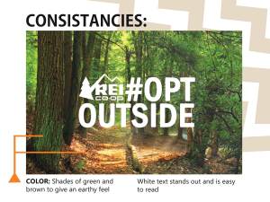
For this final project I chose to do a slide show as if I worked for REI. REI is all about the outdoors and for Black Friday 2017 they had an “Opt Outside” Campaign to help people enjoy the outdoors this holiday season. I loved this idea and thought their ads did so well to represent the joy that comes from nature.
Since this presentation would be given to members of the REI Company, I wanted it so have a simple, outdoorsy feeling. To do this, I added zigzag to the upper right hand corner of the slides. I chose a zigzag pattern because I wanted them to match the line of the REI logo and also to add a rougher, mountainous look. I placed the zigzags in the top right corner so they would not interfere with the text as it was being read. That is also why they are so light in color, almost like a watermark. On the transition slides I used a very light blue-green color to match both the original ad and also my new ad.
ORIGINAL AD
Design
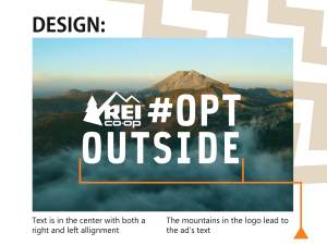
In this ad REI placed the text in the center, both vertically and horizontally. Usually center alignment is hard to read but because they made it so it was also both right and left aligned, it creates a balance for our eyes. We don’t have to search for the beginning or end because it is in a visual square and we know what is supposed to come next.
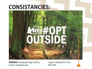
The logo was placed in the left corner as if to say that is what is most important and we should read first. The tree catches our eye and the mountains lead our eyes to the line of text. This helps us to make a subconscious connection between the logo and the text.
Typography
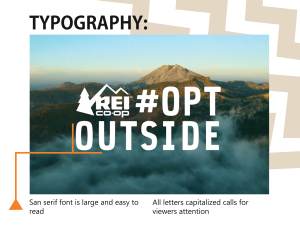
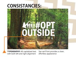
I love the font REI used for this ad! It is a simple san serif font. The letters in the ad are all capitalized as if they are shouting at us to read them. Since there are no serifs (the little wings that sometimes come off letters) the text is still very easy to read even though it is all capitalized. It is almost as if they right aligned their text so the logo could fit in the space to the left. This creates a visual box that makes it look both left and right aligned. This is very visually pleasing to the eye as it feels contained yet very open.
Photography
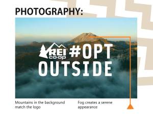
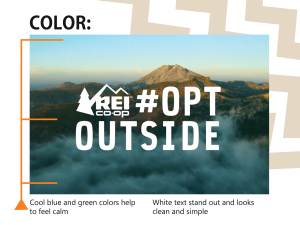
Also in the backgrounds REI used a photograph of the mountains. This is one of the most commonplaces a person goes while enjoying nature. It also matches the mountains in the logo. Even though they are quite different, subconsciously we connect the two and it is counted as repetition in our minds. This repetition makes it easier for us to associate the image and the company as one.
Color
Blues and greens are generally soothing colors. They are generally associated with nature and emote a feeling of safety, relaxation, and freshness. These are great for REI because without doing much they promote these feelings through their advertisement. When people see these colors they feel a sense of awe and want to become a part of what is going on. It is like an unseen call to action, an invisible invitation to join in on the cause. By using these refreshing colors, more people feel inclined to be a part of the campaign.
The white text on the ad stands out from the background. It presents the ad with a clean appearance. The white text is a simple color that directs or attention but isn’t distracting.
NEW AD
Design
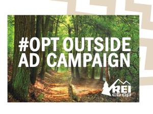
For my slide I also placed my text in the center of the ad. Like REI’s original ad, I left aligned the logo with the text. For my scenic background I chose to use a forest. I wanted it to be a little more simple than the original to imply that going out in nature doesn’t necessarily mean you have to hike a mountain. Walks in the woods or simply enjoying the trees could also count into the Opt Outside Campaign.
Typography
In my ad, I couldn’t quite find the original text. Instead, I chose a similar san serif font. I chose one that had softer edges to more closely match the original. I used all caps to make my ad also “call out” for attention. I made sure that my text aligned on the right and that the logo lined up with the edge of my text on the left. I placed this block of text in the center, just as the original ad did.
Photography
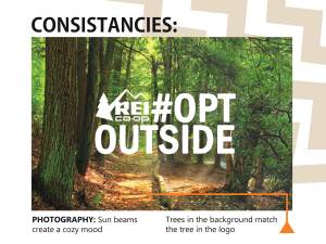
I liked how in the original ad, they used the mountains from the logo as the main photo for the background. So I decided to also play on that idea. Since there is a tree in their logo, I chose a picture of trees. I also wanted to have a cozy mood, since the original was more of a refreshing feel. I chose this picture because I liked how it seemed like the sun beams were coming through the trees without being an obvious beam of light. I darkened a part of it so my text would stand out a little better also.
Color
I wanted an earthy feeling in my new ad so I looked for pictures with some darker greens, browns and yellows. These colors are warmer and help to give a comforting mood to the photograph. Since the original was such a cool ad and mine was so much warmer toned, I was worried that the white text would be too much of a contrast. I played with a few different off white colors to help warm up the text also. After many attempts though, I decided to just go with a pure white for the text. I ended up choosing the pure white because it gave my ad the clear, crisp look that I wanted. I think by choosing the pure white it also creates another similarity between the original and the new ads.
General Slide Show Overview
When I think of colors for outside, I always think of greens, browns, blues, and yellows. Since this campaign is all about going outside and enjoying nature I wanted to use colors that would commonly be associated with the outdoors. For my transition slides I used a light blue-green color to tie in the cool feelings of the original ad and the cozy feeling of the new ad. Along the top right corner of my slides I did three zigzag lines to match the uneven edge of mountains. I created the zigzags using Adobe Illustrator. I chose a light tan color for those zigzags so they would not be distracting to the ad or the copy on the slides. I chose a triangle as the base of my pointer lines because I wanted it to have the angles of a mountain and arrow. I chose to use orange as the color because it is a bright color that stood out above both ads. It is also a color that can be found in nature so it looks like it belongs more than a red or other bright color.
I really loved doing this project! I liked seeing how there are so many options and changes you can easily make while using the Adobe InDesign program. It was cool to see how the three programs (Illustrator, Photoshop, and InDesign) work together so seamlessly. It was cool to learn how to mesh two different color schemes and ads into one slide show. Finding ways to stay consistent while being unique was a challenge but it was fun!
Links:
Forest: https://pixnio.com/nature-landscapes/forest/forest-path-wood-tree-landscape-nature-leaf-environment-ecology
REI Original Ad: http://gaia.adage.com/images/bin/image/jumbo/REI-_OptOutside_Anthem_Film_15.jpg
REI Logo PNG: https://en.wikipedia.org/wiki/File:Rei_coop_logo.png
